Wedding color palette ideas: 6 palettes with hex codes
Use 3 to 5 colors in a 60/30/10 split: a light base, one or two main colors, one accent. Six palettes with hex codes, plus how to preview yours.
The best wedding color palette ideas use three to five colors with clear jobs: one light base that covers most of the day, one or two main colors, and one small accent. Below are six wedding color palette ideas with exact hex codes, split by how much of the day each color should cover, so you can hand the same numbers to your florist, your printer and whoever designs your invitations.
You’ll also see one AI-made table we recolored from a fall palette to dusty blue in a single edit, so you can preview a palette before you order a single flower, plus how to keep your colors consistent from screen to print.
How many colors should a wedding palette have?
Three to five. Fewer than three tends to look flat in photos; more than five gets hard to match across linens, flowers, paper and attire, because every vendor has to hit every shade.
The easiest way to keep five colors from fighting is the 60/30/10 split that interior designers use for rooms: about 60% of what guests see is a base color, 30% is your main colors, and 10% is an accent. Apartment Therapy’s explainer on the 60-30-10 rule describes it as a guideline for balance rather than a strict formula, and that’s the right way to use it for a wedding too.
At a wedding, the split usually lands like this:
| Share | Role | Where it shows up |
|---|---|---|
| About 60% | Base (light neutral) | Tablecloths, invitation paper, signage background, the venue’s walls |
| About 30% | Main colors (1–2) | Flowers, napkins, bridesmaid dresses, ties, envelope liners |
| About 10% | Accent | Candle holders, cutlery, wax seals, ribbon, the date on the invitation |
The base doesn’t have to be white. Cream, ivory, sand and soft grey all work, and they feel warmer next to flowers and candlelight.
6 wedding color palette ideas with hex codes
Each palette below has four colors in the 60/30/10 split. The width of each block shows roughly how much of the day it should cover.
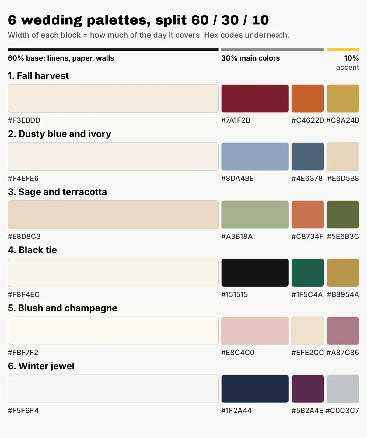
- Fall harvest: cream #F3EBDD as the base, burgundy #7A1F2B and burnt orange #C4622D as the main colors, gold #C9A24B as the accent. Warm and rich, made for October and November.
- Dusty blue and ivory: ivory #F4EFE6, dusty blue #8DA4BE, slate blue #4E6378 and champagne #E6D5B8. Calm and easy to wear: dusty blue suits most bridesmaids.
- Sage and terracotta: sand #E8D8C3, sage #A3B18A, terracotta #C8734F and olive #5E6B3C. Earthy and relaxed, good for barns, gardens and desert venues.
- Black tie: ivory #F8F4EC, black #151515, emerald #1F5C4A and gold #B8954A. Formal evening weddings, where dark suits already bring the black.
- Blush and champagne: ivory #FBF7F2, blush #E8C4C0, champagne #EFE2CC and mauve #A87C86. Soft and romantic. Mauve keeps it from washing out in photos.
- Winter jewel: snow #F5F6F4, navy #1F2A44, plum #5B2A4E and silver #C0C3C7. Deep colors for December to February, lovely under candlelight.
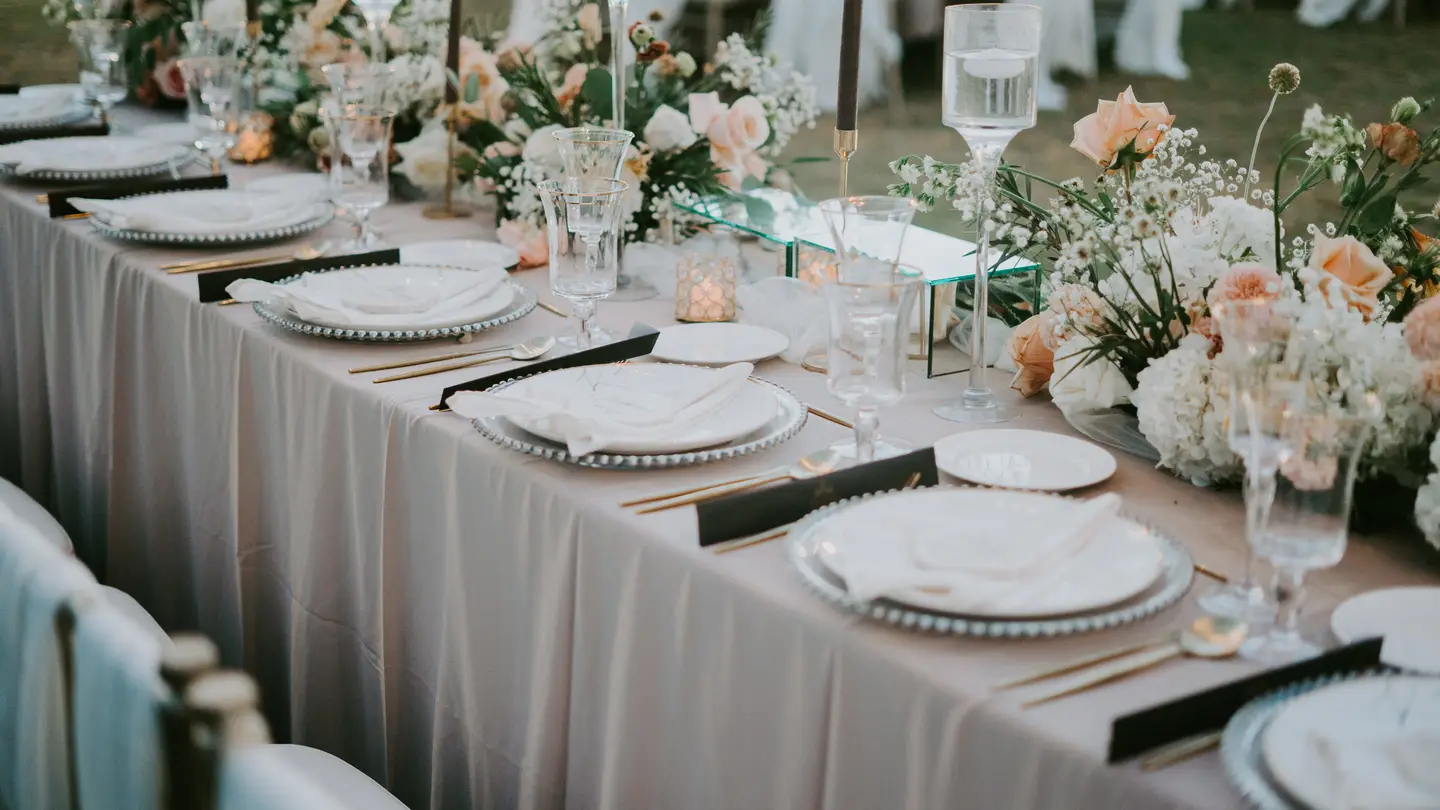
The cover photo of this article is a real table close to number 5: a greige tablecloth as the base, blush and peach flowers as the main colors, and small black place cards and gold cutlery as the accents.
Can you preview a wedding palette before you commit?
Yes. Before you pay for samples, you can see your palette on a real-looking table with an AI image. We made the fall table below with Create, our AI image generator, for 1 credit. It’s an AI image, not a photo of a real wedding.
A photoreal close view of a rustic wedding reception table in autumn: a cream linen tablecloth, low centerpieces of deep burgundy dahlias and burnt orange roses, a runner of sage green eucalyptus, brushed gold candle holders with lit cream taper candles, cream plates with folded burgundy napkins and gold cutlery, soft warm late afternoon window light, calm and elegant mood, no people
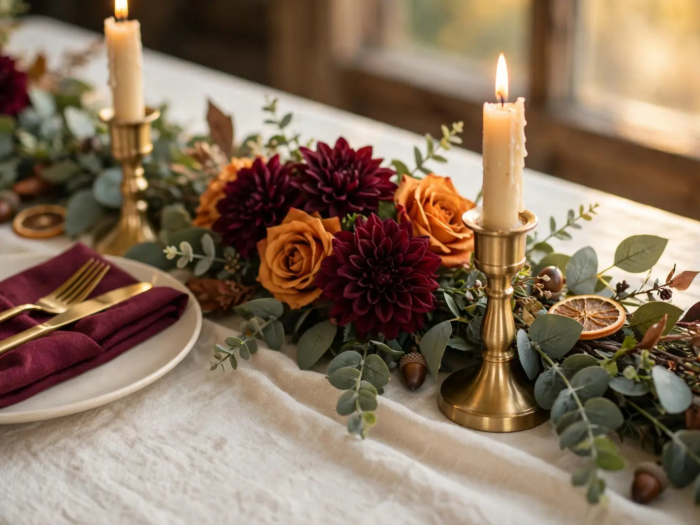
Then we asked Edit by prompt to swap the palette and keep everything else:
Change only the colors of the decor to a dusty blue and ivory palette: make the flowers pale dusty blue and ivory white, make the napkins a soft slate blue, and make the candle holders a pale champagne color. Keep the table, the tablecloth, the plates, the cutlery, the eucalyptus, the candles, the camera angle and the light exactly as they are.
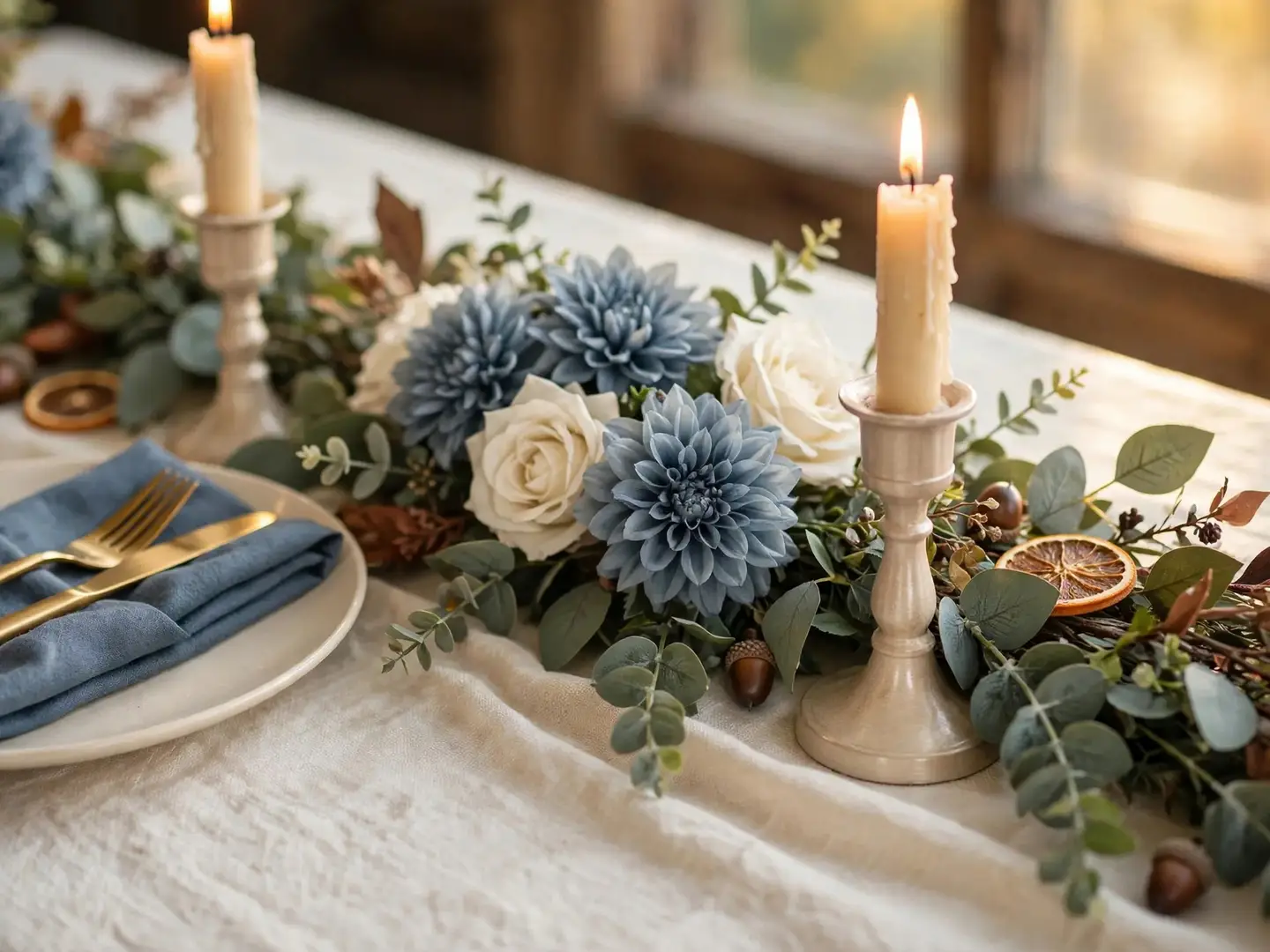
The edit did what we asked: blue dahlias, ivory roses, a blue napkin and pale candle holders, while the tablecloth, plates, candles and light stayed put. It also kept a few fall details we didn’t mention (the dried orange slices and acorns), which is a useful reminder: if a prop belongs to the old palette, name it in the edit too.
Two images, 2 credits, and you can compare palettes side by side. Here’s the routine:
- Write one prompt for your real setup: your venue type, table shape, flowers and light.
- Generate it in Create with your first palette’s color names.
- Open it in the free photo editor and use Edit by prompt to swap in palette two, then palette three. Each edit costs 1 credit.
- Put the versions next to each other and pick the one you still like the next morning.
New to prompts? Our guide to writing AI image prompts that get what you want covers the structure. Treat these images as a mood board, not a promise: real flowers vary by season and supplier, so show your florist the picture and the hex codes together.
How do you keep wedding colors the same on screen and in print?
Hex codes are screen colors. Printers use ink, and ink can’t reproduce every color a screen can, so bright, saturated shades often come out darker or duller on paper. HP’s guide to RGB versus CMYK explains why: screens add light, while ink on paper absorbs it.
A few habits keep your colors steady:
- Order a printed proof of your invitation before the full run, and look at it in daylight, not under a desk lamp.
- Give pale colors some contrast. Blush text on ivory paper can almost disappear. Use your darkest color (burgundy, slate blue, olive, black, mauve or navy above) for names and dates.
- Match fabric to the printed swatch, not the screen. Bring the printed proof to dress and linen fittings.
- Keep one master file with your four hex codes and share it with every vendor, so nobody guesses from a photo on their phone.
How to use your palette on invitations and wedding posts
Your palette also has to work on save-the-dates, your wedding website and the announcement posts. In our free photo editor, the Text tool can pick a text color straight from a photo, so a headline on your engagement photo can match the flowers exactly. Type your hex codes into the color picker for everything else.
For the main text, stick to your darkest color on your lightest base. If the words sit on top of a busy photo, our comparison of four ways to make text readable on a photo shows which fixes hold up.
When the design is done, the social media resizer exports it for Instagram, Facebook, Pinterest and the rest in one zip, free, so your save-the-date looks right on every feed.
Your next step
Pick the palette above that’s closest to your venue and season, then copy its four hex codes into a note on your phone. Make one AI image of your table in that palette, edit it into your second choice for 1 more credit, and send both to your partner tonight. New accounts get 20 free credits on sign-up, no card needed, which covers plenty of tries.
Questions people ask
- What are timeless wedding colors?
- Palettes built on a light neutral base (ivory, cream, white) with one muted main color, such as sage, dusty blue or blush, and a metallic accent tend to age well in photos. Very bright, trend-driven shades date faster.
- Should the wedding party wear the main color or the accent?
- Usually a main color. Dresses and ties cover a lot of space in photos, so putting the accent on them can tip the balance; save the accent for small details like ties, pocket squares or bouquet ribbon.
- Do wedding colors have to match the season?
- No, but it makes flowers easier and cheaper to source. Deep reds, oranges and plums suit fall and winter; pastels and soft greens suit spring and summer.
- Can I use an AI image of my palette on my wedding website?
- Yes, AI images from our generator can be used, including commercially. Say it's an illustration, not a photo of your venue, and note that AI images have no legal protection and may not be copyrightable.
Keep reading
 DesignHow to make text readable on a photo: 4 fixes comparedGive the words a calm, high-contrast spot: a dark gradient, a color box, or a cleared area. We tested all four on one busy photo, with contrast numbers.
 AI image generationImage to image AI generator: how it works, with a real exampleAn image to image AI generator turns a photo you have into a new version. See one room edited twice, the exact prompts, and when to use each method.
 LicensingFree royalty-free images for commercial use: what to checkFree images can be used commercially, but free rarely includes releases or protection. Compare 5 sources and run our 7-point check before you use one.