How to make text readable on a photo: 4 fixes compared
Give the words a calm, high-contrast spot: a dark gradient, a color box, or a cleared area. We tested all four on one busy photo, with contrast numbers.
To make text readable on a photo, give the words a calm, high-contrast place to sit: darken the area behind them, put them in a solid color box, or move them onto a plain part of the picture. Picking a bolder font or a bigger size helps, but on a busy photo it’s never enough on its own.
Below, we put the same headline on the same busy photo four ways, so you can see which fixes work and why. Then you’ll get the contrast numbers to aim for, the steps in our free editor, and a quick checklist to run before you post.
Why does text disappear on some photos?
Because the photo is doing too much where the words are. Text needs contrast with what’s directly behind it, and a busy photo changes color and brightness every few pixels. White letters that read fine over a dark pumpkin vanish over a sunlit one.
The web accessibility standard, WCAG’s contrast guideline, asks for a contrast ratio of at least 4.5:1 for normal text and 3:1 for large text, and it applies to text over images too. For reference, white on a pumpkin orange like #e8741c measures about 3:1, right on the edge even for a big headline. White on a sunny yellow measures about 1.5:1, which is close to invisible.
Two things make it worse on social media:
- Phones shrink everything. A headline that looks huge on your laptop is a few millimeters tall in someone’s feed.
- People scroll fast. If the words take effort to read, most people won’t make the effort.
What does the same headline look like with 4 different fixes?
We made one deliberately difficult photo for this test: a crowded autumn farm stand, full of orange, red, green and hard sunlight. It was made with AI in Create for 1 credit, and it’s not a real farm stand. Then we set the same headline, “Fall market, Saturday 8 to 2,” on it four ways.
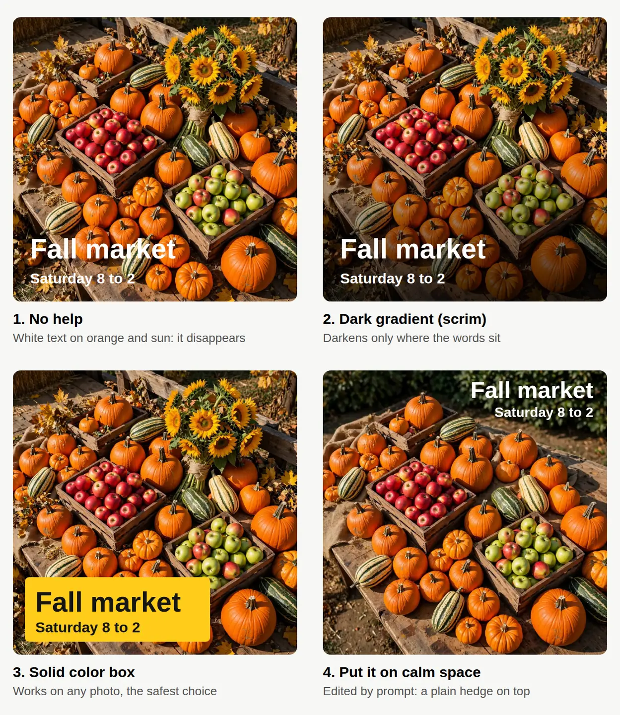
Here’s what each one does:
- No help. The letters cross pumpkins, crates and squash. Parts of “market” and “Saturday” break up, and the small line is the first to go.
- Dark gradient (a scrim). A dark fade at the bottom of the photo, from clear to about 80% black, under the text. The top of the photo stays bright and colorful; only the area under the words gets calmer.
- Solid color box. Dark text in a yellow box. Our ink #151515 on yellow #ffcc1a measures about 12:1, far above the 4.5:1 minimum. This one works on any photo, which is why it’s the safest choice for a template you reuse every week.
- Calm space. Instead of fixing the text, we fixed the photo: we used Edit by prompt to replace the busy top of the image with a plain hedge, then put white text there with a soft shadow.
Can you make room for text by editing the photo?
Yes, and it’s often the cleanest result, because nothing covers the picture. This is the before and after from the fourth example, both made with AI.
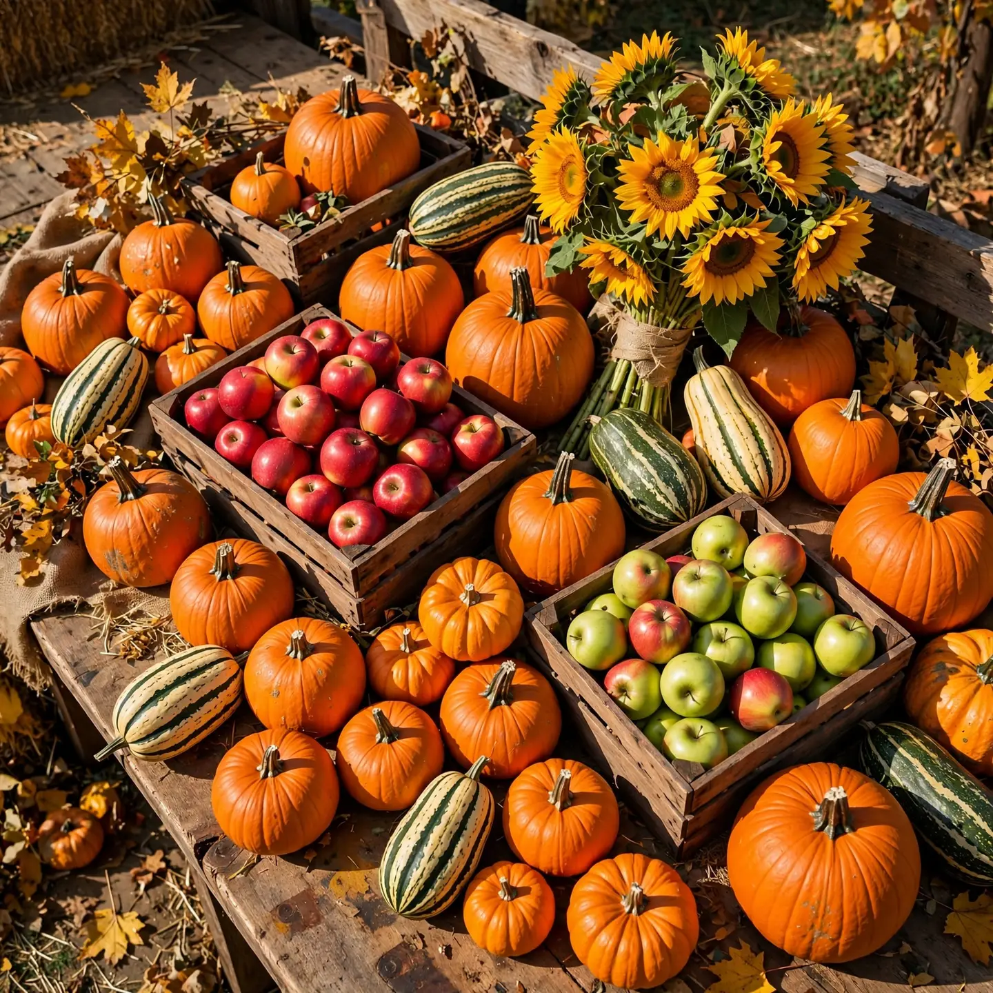
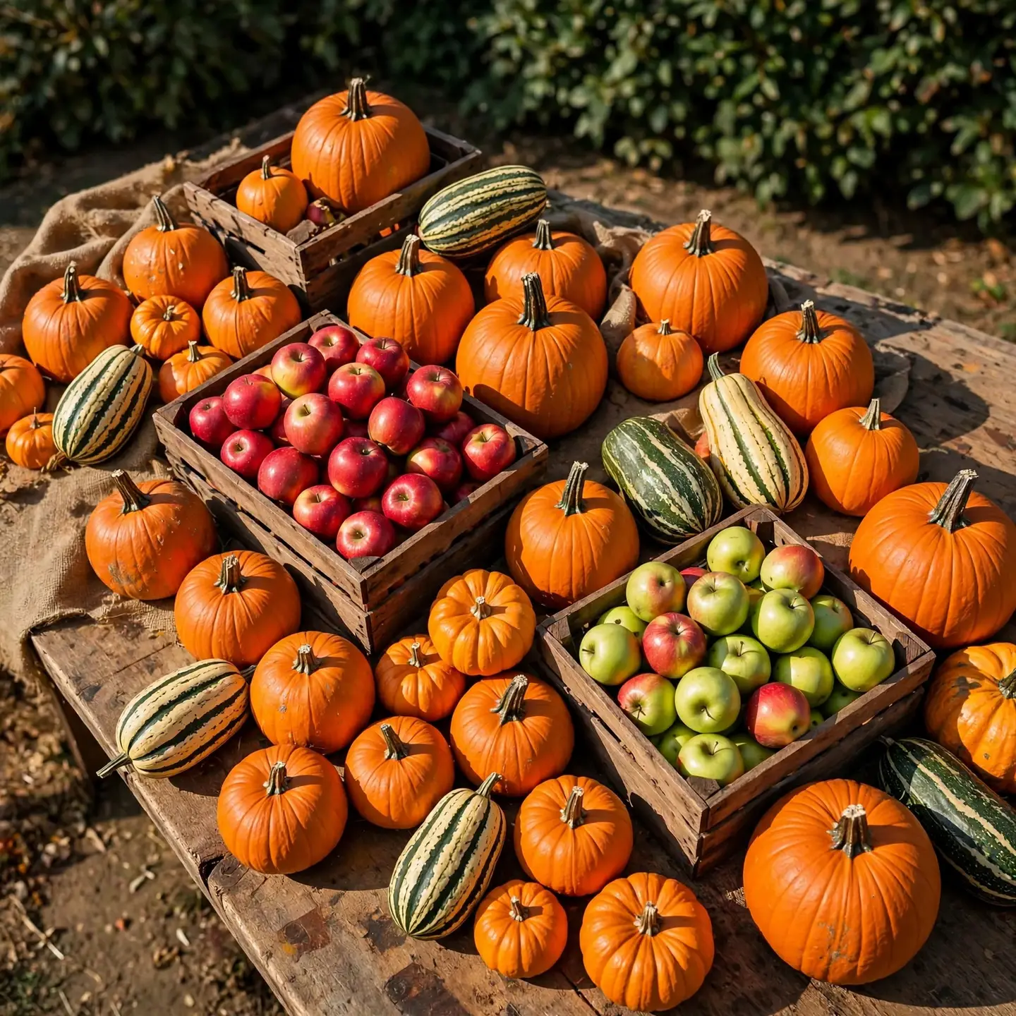
The prompt we used:
Remove everything from the top third of the image and replace it with a plain, softly out-of-focus dark green hedge, so the top third is calm and simple. Keep the produce on the table in the lower part exactly as it is.
It didn’t follow the instruction exactly. The hedge took roughly the top fifth of the frame, not a full third, and the sunflowers went with it. But the pumpkins, apple crates and squash below stayed where they were, and the new dark band was big enough for a two-line headline.
A few things worth knowing before you try it:
- Name the plain thing you want, like “a plain hedge,” “a clear blue sky” or “an empty wooden wall.” “Make space for text” is vaguer and gives the AI less to go on.
- Say what must stay the same. Listing the produce kept it untouched.
- Licensed stock photos can be edited too, but say it was edited with AI, and know that our legal protection covers the original photo only (see the license).
If the clutter is small, like a sign or a stray box, the free Magic eraser may be enough. We walked through it in how to remove unwanted objects from a photo.
How do you do each fix in our free editor?
All of these run in our free photo editor, with no watermark. Only Edit by prompt costs anything (1 credit an edit).
| Fix | Tool in the editor | How |
|---|---|---|
| Color box | Text | Add your text and turn on the color box behind it. Use “pick a text color from the picture” for a color that matches the photo. |
| Darker area behind the words | Adjust & Finetune | Select the area where the text goes and lower the exposure only inside that selection. |
| Outline or shadow | WordArt | Pick a style with an outline or shadow so each letter has its own dark edge. |
| Calm space | Edit by prompt, or Magic eraser | Replace a busy area with something plain, or brush away small clutter. |
| Separate the text from the photo | Layers | Keep text on its own layer, so you can move it later without redoing the photo. |
One honest note: the editor’s selection darkening gives you a darker area with an edge, not the smooth fade in our second example. On many photos that’s fine, especially behind a short headline. If the edge looks harsh, a color box or a WordArt shadow is the quicker fix.
What’s the quickest readability check before you post?
Run these five checks on the finished image, at the size people will actually see it:
- [ ] Phone test. Look at it on your phone at full feed size, not zoomed in. Can you read the smallest line without squinting?
- [ ] Squint test. Squint or step back. The words should still stand out as a shape before the photo does.
- [ ] Grayscale test. Drop the saturation to zero for a second in Adjust & Finetune. If the text and the background turn the same gray, the contrast is too low.
- [ ] Edge test. Keep text away from the edges. Platforms crop previews, and the social media resizer exports one design in a different shape for each platform, so check every size for words that got cut.
- [ ] One message. A headline and one short line. If you need more, it belongs in the caption.
If you plan a lot of posts at once, set up one layout that passes these checks and reuse it. A box in the same corner every week is quicker to make and easier for your followers to recognize. Our Q4 social media content calendar shows how to plan those posts ahead.
What should you try first?
Open your next post in the editor and try the color box first: it takes under a minute, and it works on every photo. If you’d rather keep the whole picture visible, use Edit by prompt to clear one plain area for the words, which costs 1 credit. New accounts get 30 free credits on sign-up, no card needed, then 3 free credits every day (see pricing).
Questions people ask
- What font size should text be on an Instagram or Facebook post image?
- There's no single number, because feeds show images at different sizes. Make the smallest line readable when you view the post on your phone at normal feed size, and keep it to a headline plus one short line.
- Is a drop shadow enough to make text readable?
- On a fairly calm photo, often yes. On a busy, bright photo a shadow alone usually isn't enough; pair it with a darker area behind the text or switch to a color box.
- Should text on a photo be white or black?
- Whichever contrasts more with the area right behind the words. White works over dark or darkened areas; dark text works on light areas and in light-colored boxes.
- Does adding text to a stock photo change the license?
- No. Editing doesn't change the license, so you can add text for ads and social posts. Our legal protection covers the original photo only, not the text or changes you add.
Keep reading
 AI image generationWhich AI image style fits your brand? One prompt, 4 stylesKeep the scene, swap only the style words. We made one café scene in 4 AI styles for 4 credits: the exact prompts, what each suits, and how to stay consistent.
 Creator businessHow to plan a Q4 social media content calendarMark the fixed dates, split 13 weeks into three phases, and budget every image up front. A 39-post plan whose images cost 108 credits in total.
 Photo editingHow to change the season in a photo with AIName the season, say what changes and what stays, and one AI edit turns summer into fall. A real before and after, the exact prompts and a season cheat sheet.