Avenir font pairing: 6 combinations and free look-alikes
Avenir pairs best with a high-contrast serif like Playfair Display or Lora. See 6 pairings with sizes, 3 free look-alikes and a social post done two ways.
The best Avenir font pairing is usually a serif with real contrast, such as Playfair Display, Lora or EB Garamond, with Avenir doing the quiet work in the body text. Avenir is clean and even, so a partner with thick-and-thin strokes gives the page its personality. Below are six Avenir pairings with the sizes we used, three free look-alikes for when you don’t have Avenir, and the same social post designed two ways.
One honest note first: Avenir is a paid font and isn’t on Google Fonts, so in our images Avenir’s part is played by Nunito Sans, a free look-alike. The partner fonts are the real ones.
What is Avenir, and why is it so easy to pair?
Avenir is a geometric sans serif designed by Adrian Frutiger and released by Linotype in 1988. The name is French for “future,” a nod to the older geometric sans Futura, according to Wikipedia’s history of the typeface. Frutiger later reworked the family with Akira Kobayashi as Avenir Next, with more weights and condensed styles.
That history explains why it pairs so well:
- It’s calm. Round letters, even strokes and generous spacing. It never fights the headline font.
- It has a wide range of weights. You can use one family for the whole page: Heavy or Black for headlines, Book or Roman for body text.
- It reads well small. That makes it a natural body font under a more decorative headline.
If you work on a Mac or an iPhone, you may already have Avenir and Avenir Next installed with the system. That copy is for your device. Putting Avenir on a website, in an app or in a logo file you hand to someone else needs a license from the font’s publisher, so check that before you build a brand on it.
6 Avenir font pairings, with the sizes we used
Each card shows the headline font on top and the body font underneath.
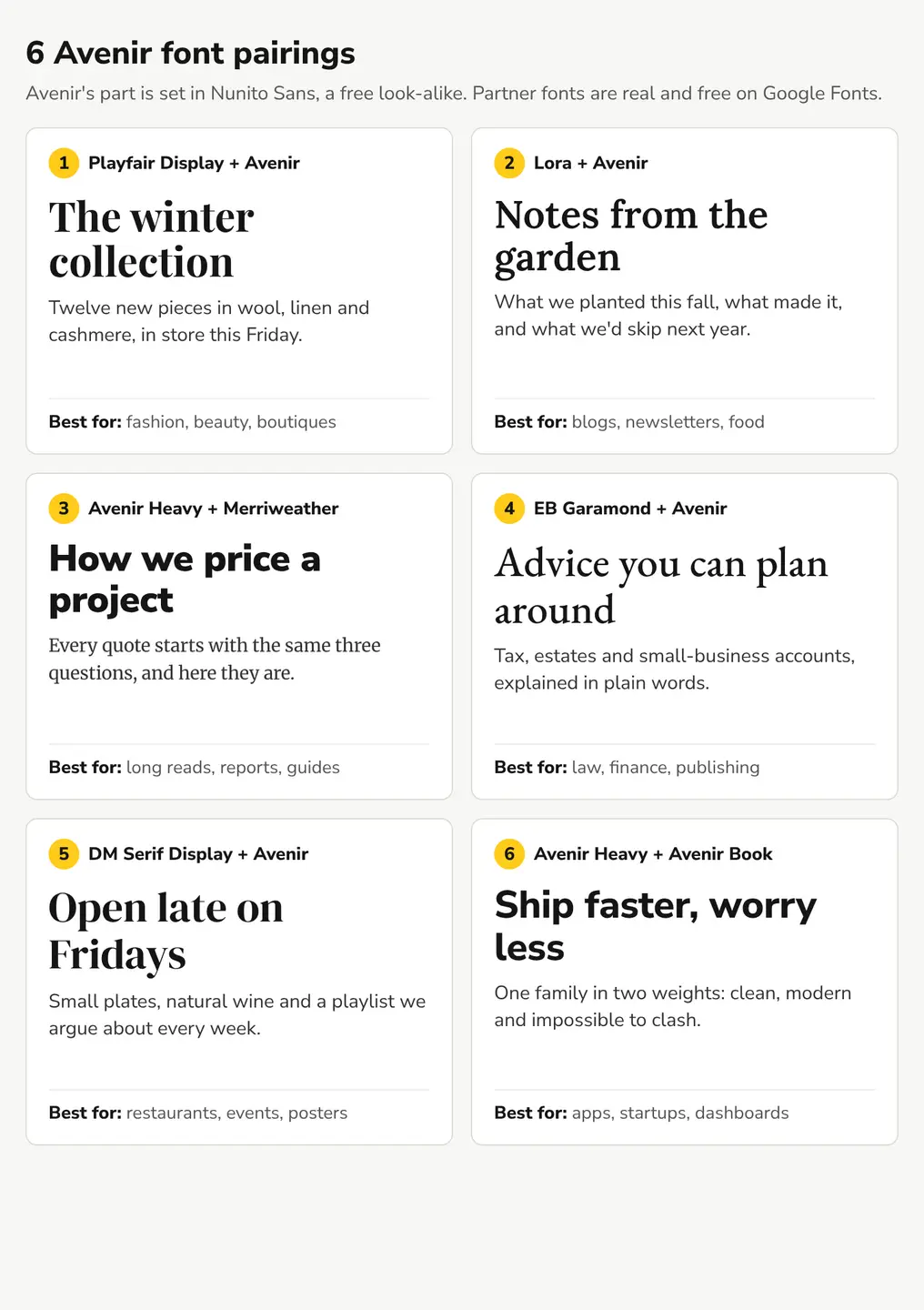
- Playfair Display + Avenir. The classic. Playfair’s sharp, high-contrast strokes against Avenir’s even ones look expensive without trying. Start here for fashion, beauty and boutiques.
- Lora + Avenir. Softer and warmer. Lora’s brushed curves suit blogs, recipes and newsletters where you want to sound friendly rather than formal.
- Avenir Heavy + Merriweather. Flip the roles: a bold Avenir headline and a sturdy serif for the reading. Merriweather was designed for screens, so it holds up in long articles and reports.
- EB Garamond + Avenir. Traditional and trustworthy. A good fit for law and accounting firms, publishers and anyone whose clients want to feel they’re in safe hands.
- DM Serif Display + Avenir. Chunky and confident. It works at poster sizes, so use it for restaurants, events and anything printed big.
- Avenir Heavy + Avenir Book. One family, two weights. It can’t clash, which is why so many apps and startups use exactly this.
Sizes and weights
| Pairing | Headline | Body | Use it for |
|---|---|---|---|
| Playfair Display + Avenir | Playfair Display Bold, 64px | Avenir Book, 30px | Fashion, beauty, boutiques |
| Lora + Avenir | Lora SemiBold, 60px | Avenir Book, 30px | Blogs, newsletters, food |
| Avenir Heavy + Merriweather | Avenir Heavy, 58px | Merriweather Regular, 28px | Long reads, reports, guides |
| EB Garamond + Avenir | EB Garamond Medium, 66px | Avenir Book, 30px | Law, finance, publishing |
| DM Serif Display + Avenir | DM Serif Display, 66px | Avenir Book, 30px | Restaurants, events, posters |
| Avenir Heavy + Avenir Book | Avenir Heavy, 60px | Avenir Book, 30px | Apps, startups, dashboards |
Those sizes are for a 1080px-wide social image. On a website keep the same idea: a headline roughly twice the size of the body, with body text at 16px or more.
How do you choose a font to pair with Avenir?
Avenir is the easy half of the pair, so the choice is really about the other font. Three checks:
- Pick contrast, not a cousin. Avenir next to Futura, Montserrat or another geometric sans looks like two slightly different versions of the same thing. Choose a serif, or use Avenir alone in two weights.
- Match the mood to the business. High-contrast serifs (Playfair, DM Serif) feel premium. Softer serifs (Lora) feel friendly. Old-style serifs (Garamond) feel established.
- Keep it to two fonts. Two families, two weights each, is plenty. A third font is the most common reason a layout “looks off.”
If you’re unsure, use Playfair Display for headlines and Avenir for everything else. It’s hard to get wrong.
What are free alternatives to Avenir?
If you don’t have an Avenir license, or you need a font you can embed on a website for free, three Google Fonts come close in feel. We set the same words in each:
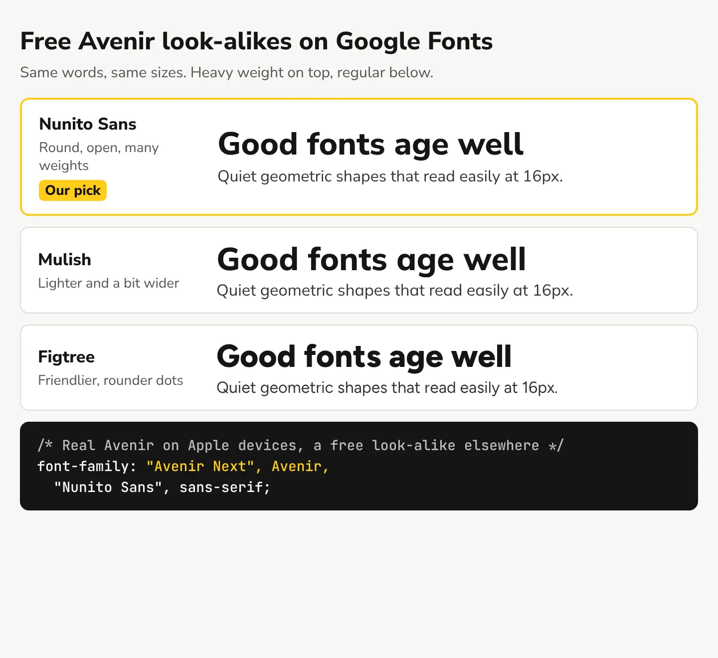
- Nunito Sans. Our pick. Open, round shapes and a wide range of weights from light to black, so the Heavy + Book trick still works. It’s free on Google Fonts under an open license.
- Mulish. A little lighter and wider. Nice for minimal brands and lots of white space.
- Figtree. Friendlier, with rounder dots and a slightly bouncier feel. Good for apps and casual brands.
Use real Avenir where it exists, a look-alike everywhere else
On a website you can ask for Avenir first and fall back to a free font. CSS tries each font in the font-family list in order and uses the first one the device has:
font-family: "Avenir Next", Avenir, "Nunito Sans", sans-serif;
Visitors on Macs and iPhones see the Avenir already on their device, and everyone else sees Nunito Sans (load it from Google Fonts). You’re not sending the Avenir file to anyone, only naming it.
What does an Avenir pairing look like on a social post?
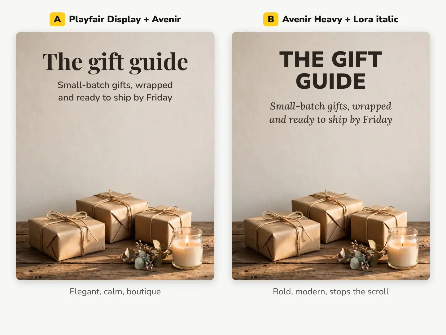
Here’s one 4:5 Instagram post for a gift shop, designed with two different pairings. The background is an AI image we made with Create, our AI image generator, for 1 credit. It’s an AI image, not a photo of a real shop. We asked for a calm, empty top half so the text has room:
A photoreal photo of a rustic wooden table against a warm off-white plaster wall, a few gifts wrapped in plain brown kraft paper with natural twine, a small sprig of dried eucalyptus and a lit candle in a clear glass jar in the lower third of the frame, soft warm afternoon light, the upper half of the frame is the calm empty plaster wall with nothing on it
What the comparison shows:
- Version A (Playfair + Avenir) feels like a boutique: elegant, calm, a little premium.
- Version B (Avenir Heavy in capitals + Lora italic) reads faster at feed size and feels more modern. The italic serif keeps it from looking like a tech ad.
- Both work because the background gives the text a plain area. On a busy photo, the same fonts would need a color box or a gradient behind them. Our guide to making text readable on a photo compares four fixes.
Pairing a classic serif instead? See our Caslon font pairings, set in the real fonts.
Make your own Avenir post in 5 steps
- Pick a pairing. Not sure? Playfair Display + Avenir, or Avenir Heavy + Avenir Book.
- Get a background with empty space. Choose a real photo from our stock library for 10 credits ($0.10), or describe one in Create for 1 credit and ask for an empty area where the text will go.
- Add the text in our free photo editor. Use the Text tool for the headline and caption, add a color box behind the words if the photo is busy, and pick the text color straight from the picture. If Avenir isn’t in the font list, use the closest clean sans serif and keep the same sizes.
- Check it at phone size. Shrink the preview to feed size. If the caption gets lost, make it bigger or bolder, not longer.
- Export every size at once with the social media resizer: one design out as Instagram, Facebook, Pinterest and more, in one zip, free.
New accounts get 50 free credits with no card, then 3 free credits every day, which is plenty to make a few backgrounds and test both pairings before the holiday posts go out.
Questions people ask
- Is Avenir a serif or sans serif font?
- Avenir is a sans serif. It's a geometric sans with round letters and even strokes, which is why it pairs so well with serifs that have thick-and-thin contrast.
- What's the difference between Avenir and Avenir Next?
- Avenir Next is the reworked version of the family, made by Adrian Frutiger with Akira Kobayashi. It adds more weights and condensed styles. For pairing, treat them the same way.
- Does Avenir go with Futura or Montserrat?
- Usually not as a headline and body pair. They're all geometric sans serifs, so together they look almost the same but not quite. Pair Avenir with a serif, or use two weights of Avenir.
- Is Avenir good for a logo?
- Yes, for brands that want to look clean and modern. Check the font license covers logo use first, and try a heavier weight so the logo still reads at small sizes.
Keep reading
 DesignBedroom color palette ideas: 6 palettes, tried on one roomUse one wall color for about 60% of the room, lighter bedding and one accent. Six bedroom palettes with hex codes, light values and an AI room recolored.
 DesignCaslon font pairing: 6 combinations, shown in the real fontsCaslon pairs best with a clean sans like Inter, Work Sans or Lato. See 6 free pairings set in the real fonts, with sizes and a social post done two ways.
 DesignWedding color palette ideas: 6 palettes with hex codesUse 3 to 5 colors in a 60/30/10 split: a light base, one or two main colors, one accent. Six palettes with hex codes, plus how to preview yours.