Bedroom color palette ideas: 6 palettes, tried on one room
Use one wall color for about 60% of the room, lighter bedding and one accent. Six bedroom palettes with hex codes, light values and an AI room recolored.
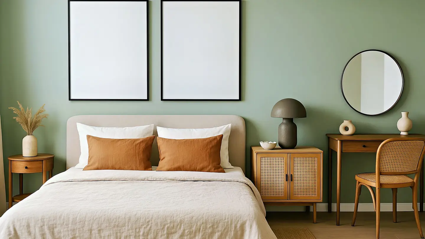
The best bedroom color palette ideas use three or four colors with clear jobs: one wall color that covers most of the room, a lighter bedding color, a wood or textile tone, and one small accent. Below are six bedroom color palette ideas with exact hex codes and a light value for each wall color, so you can tell at a glance whether a shade will feel bright and airy or dark and cozy.
You’ll also see one bedroom we made with AI and then repainted from sage to navy in a single edit, so you can compare two palettes on the same room before you buy a single sample pot.
How many colors should a bedroom palette have?
Three or four is plenty. A bedroom is a small room with a few big surfaces (walls, bed, floor, curtains), and each extra color is one more thing that has to match across paint, bedding, rugs and lamps.
The easiest way to balance them is the 60/30/10 split designers use for rooms. Apartment Therapy’s explainer on the 60-30-10 rule describes it as a guide for balance, not a strict formula. In a bedroom it usually lands like this:
| Share | Role | Where it shows up |
|---|---|---|
| About 60% | Wall color | Walls, sometimes the ceiling or a painted headboard |
| About 20% | Bedding color | Duvet, sheets, curtains, a large rug |
| About 10% | Wood or second tone | Bed frame, nightstands, flooring, a chair |
| About 10% | Accent | Cushions, a throw, lamp bases, frames, a plant pot |
If your walls stay white, flip it: let the bedding or a large rug carry the main color and keep the walls as the quiet 60%.
6 bedroom color palette ideas with hex codes
Each palette below follows that split. The width of each block shows roughly how much of the room it should cover, and the number on the right is the wall color’s light value.
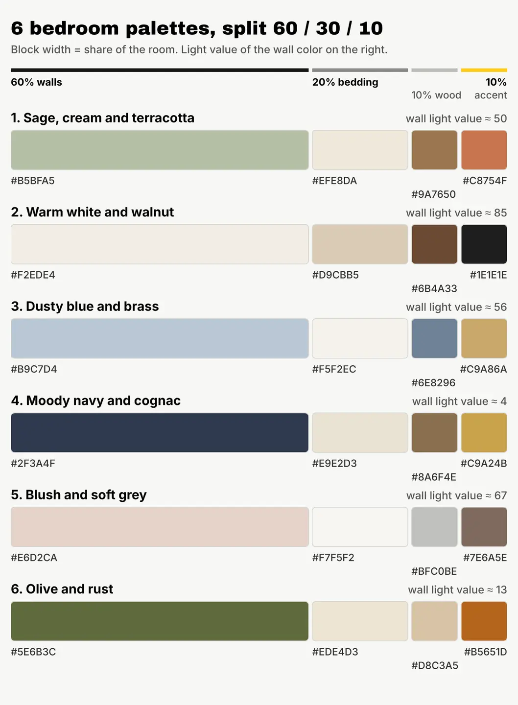
- Sage, cream and terracotta: sage walls #B5BFA5, cream bedding #EFE8DA, mid oak #9A7650 and terracotta cushions #C8754F. Calm and earthy, and forgiving in most light.
- Warm white and walnut: warm white #F2EDE4, linen #D9CBB5, walnut #6B4A33 and near-black #1E1E1E for frames and lamp bases. The safe choice for small or dark rooms.
- Dusty blue and brass: dusty blue #B9C7D4, soft white #F5F2EC, slate #6E8296 and brass #C9A86A. Cool and quiet, at its best in a sunny room.
- Moody navy and cognac: navy #2F3A4F, ivory #E9E2D3, cognac leather #8A6F4E and gold #C9A24B. Dark, cozy and a little hotel-like.
- Blush and soft grey: blush #E6D2CA, white #F7F5F2, soft grey #BFC0BE and taupe #7E6A5E. Warm without being sweet, thanks to the grey and taupe.
- Olive and rust: olive #5E6B3C, oatmeal #EDE4D3, natural linen #D8C3A5 and rust #B5651D. Rich and autumnal; works best with plenty of lamps.
What do the light values mean?
Paint makers list a light reflectance value (LRV) for each color: how much light it bounces back, from 0 (pure black) to 100 (pure white). High numbers make a room feel brighter and larger; low numbers absorb light and make it feel enclosed and cozy.
We worked out the numbers above from each hex code’s brightness on screen, using the same 0-to-100 idea. They’re a quick guide for comparing our six palettes, not a paint’s official LRV: when you pick an actual paint, check the LRV printed on its chip or product page.
As a rule of thumb:
- Above about 60 (warm white, blush): bright and airy, good for small rooms and rooms with little daylight.
- About 40 to 60 (sage, dusty blue): soft mid-tones that read as color without darkening the room much.
- Below about 20 (navy, olive): deep and dramatic. Plan for warm lamps, and keep bedding and ceiling light so the room doesn’t feel like a cave.
Which bedroom colors suit a north- or south-facing room?
The direction your window faces changes how a color looks, sometimes more than the color itself. Sherwin-Williams’ guide to choosing color by room orientation and Benjamin Moore’s colour-by-direction guide both make the same broad point:
| Window faces | Daylight | Palettes above that tend to suit it |
|---|---|---|
| North | Cool, indirect, can look grey | Warm white and walnut, blush and soft grey, sage (it has warm undertones) |
| South | Warm and strong for much of the day | Dusty blue and brass, sage, and the dark navy if you want drama |
| East | Bright in the morning, cooler later | Sage, blush, warm white |
| West | Soft in the morning, warm and golden in the evening | Dusty blue, olive and rust |
You’ll spend a lot of bedroom time under lamps, so look at any color in the evening with your own bulbs on, not just at noon.
Can you preview a bedroom palette before you paint?
Yes. Sample pots and painted boards are still the final test, but you can narrow six ideas down to two for about 2 cents on screen.
We made the bedroom below with our AI image generator, Create, from one written description (1 credit). Then we used Edit by prompt in our free photo editor to repaint it into the navy palette (1 more credit). Both are AI images, not photos of a real room.
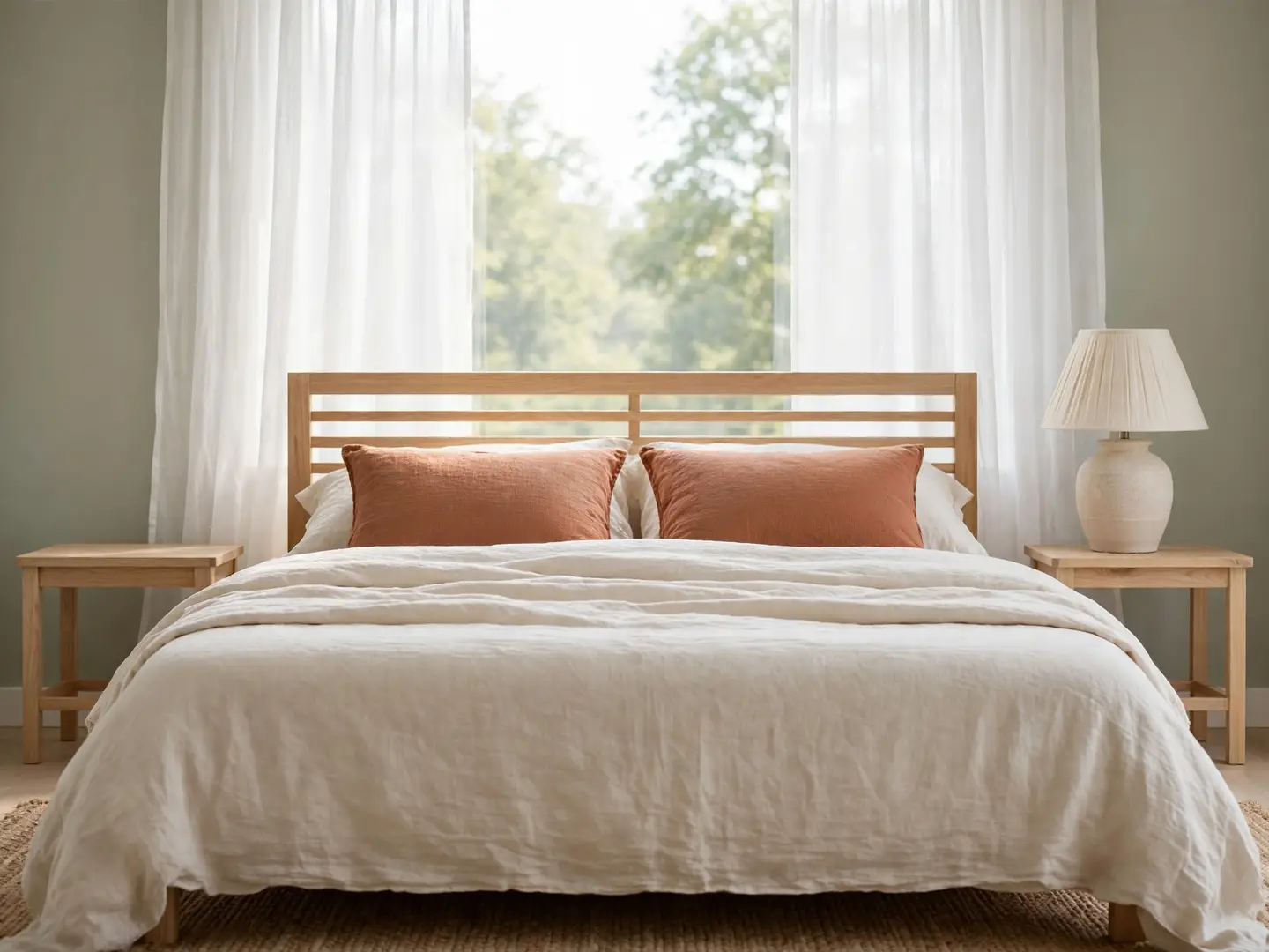
The prompt for the first image:
A photoreal bedroom interior seen from the foot of the bed: walls painted a soft muted sage green, a double bed with cream linen bedding and two terracotta colored cushions, a light oak headboard and matching oak bedside tables, a ceramic table lamp with a linen shade, a jute rug on a pale wood floor, a large window with sheer white curtains letting in soft morning daylight, calm and uncluttered, no people
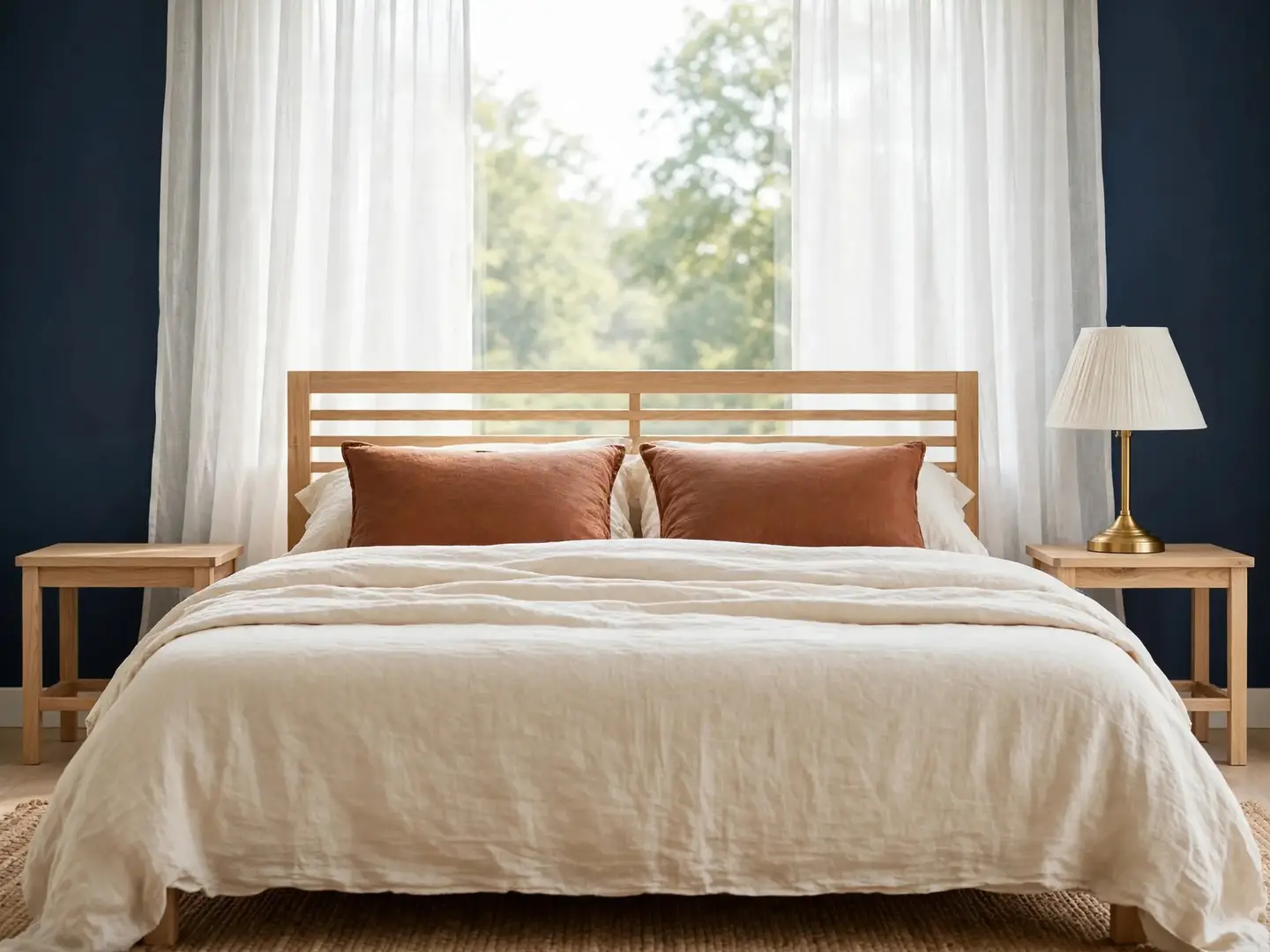
The edit prompt:
Change only the colors: paint the walls a deep navy blue, make the bedding a warm ivory, make the two cushions a cognac brown, and make the lamp base brushed gold. Keep the furniture, the bed shape, the rug, the floor, the window, the curtains, the camera angle and the daylight exactly as they are.
What we learned from the pair:
- Navy changes the mood far more than the swatch suggests. The same oak, linen and window feel cozier and more formal with dark walls.
- The warm accents carry over. Terracotta reads as soft next to sage; the cognac version looks richer against navy. One cushion change does a lot.
- Say what to keep. Listing everything that must stay (furniture, window, light) is what keeps the edit a fair comparison. Our guide to writing AI image prompts that work has more on this.
To try it on your own room, take a photo of it straight on in daylight, open it in the editor, and use Edit by prompt with “paint the walls…” and your color. It’s a preview of the mood, not an exact paint match: screens and paint chips never agree perfectly, so confirm with a real sample.
How to turn your palette into a shopping list
- Pick one palette above and write its four hex codes in a note on your phone.
- Match the wall color to real paint. Take the hex code to the paint counter or a paint maker’s color tool, then compare the closest chips’ LRV with the light value above.
- Paint two big samples on different walls and check them morning, evening and under lamps for two or three days.
- Buy the bedding next, in the 20% color. It’s easier to match paint to fabric than fabric to paint.
- Add the accent last, in two or three small places (cushions, a throw, a frame) so it repeats around the room.
If you’re planning a palette for a big day too, our wedding color palette ideas use the same 60/30/10 approach for linens, flowers and paper.
Your next step
Take one photo of your bedroom today and try your top two palettes on it with Edit by prompt, at 1 credit each. New accounts get 50 free credits on sign-up with no card, then 3 free credits every day, which is enough to test every palette here before you open a single paint can.
Questions people ask
- What is the most relaxing color for a bedroom?
- Soft, muted colors with a medium to high light value, such as sage, dusty blue, warm white or blush, are the usual picks for a calm bedroom. Very saturated colors tend to feel more energetic.
- Should the ceiling be the same color as the bedroom walls?
- With light walls, a white or slightly warm white ceiling keeps the room bright. With dark walls like navy or olive, painting the ceiling the same color can make the room feel cozier and hide the edges.
- Do dark colors make a bedroom look smaller?
- They can make the walls feel closer, which many people find cozy in a bedroom. Keep the bedding and floor lighter and add warm lamps so a dark room still feels comfortable.
- Which paint finish is best for a bedroom?
- Matte or eggshell finishes are common for bedroom walls because they hide small flaws and don't reflect much glare. Satin is easier to wipe clean if the room gets a lot of wear.
Keep reading
 DesignCaslon font pairing: 6 combinations, shown in the real fontsCaslon pairs best with a clean sans like Inter, Work Sans or Lato. See 6 free pairings set in the real fonts, with sizes and a social post done two ways.
 DesignWedding color palette ideas: 6 palettes with hex codesUse 3 to 5 colors in a 60/30/10 split: a light base, one or two main colors, one accent. Six palettes with hex codes, plus how to preview yours.
 DesignHow to make text readable on a photo: 4 fixes comparedGive the words a calm, high-contrast spot: a dark gradient, a color box, or a cleared area. We tested all four on one busy photo, with contrast numbers.