Proxima Nova font pairing: 6 combinations and free look-alikes
Proxima Nova pairs best with a contrasting serif like Merriweather or Playfair Display. See 6 pairings with sizes, a web type scale and 3 free look-alikes.

The best Proxima Nova font pairing is usually a serif with clear contrast, such as Merriweather, Playfair Display or Libre Baskerville, or simply Proxima Nova in two weights. Proxima Nova is tidy and neutral, so the partner font sets the mood. Below are six Proxima Nova pairings with the sizes we used, a web type scale you can copy, three free look-alikes, and one Black Friday post designed two ways.
A quick honest note: Proxima Nova is a paid font and isn’t on Google Fonts, so in our images its part is played by Montserrat, the free font people most often use in its place. Montserrat is a little wider, so read the images for the pairing, not the exact letter shapes. The partner fonts are the real ones.
What kind of font is Proxima Nova?
Proxima Nova is a sans serif designed by Mark Simonson and released in 2005, built on his earlier Proxima Sans, as his studio’s page for the typeface describes. It mixes round, geometric letters with the even, practical feel of a classic grotesque sans, which is why it looks modern without looking cold.
What that means when you pair it:
- It’s neutral. Proxima Nova doesn’t bring much personality of its own, so it rarely clashes. The other font decides whether the page feels premium, friendly or serious.
- It has a big range of weights, from Thin to Black. You can build a whole page from one family.
- It’s everywhere. You’ll see it on a lot of websites and apps, which is good for readability and a reason to give it a partner with character so your brand doesn’t look like every other site.
If you have a Creative Cloud plan, Proxima Nova is included in Adobe Fonts for your designs and websites under that plan’s terms. Otherwise you’ll need a license from the foundry, or a free look-alike (below).
6 Proxima Nova font pairings, with sizes
Each card shows the headline font on top and the body font underneath, at the sizes we’d use on a 1080px-wide social image.
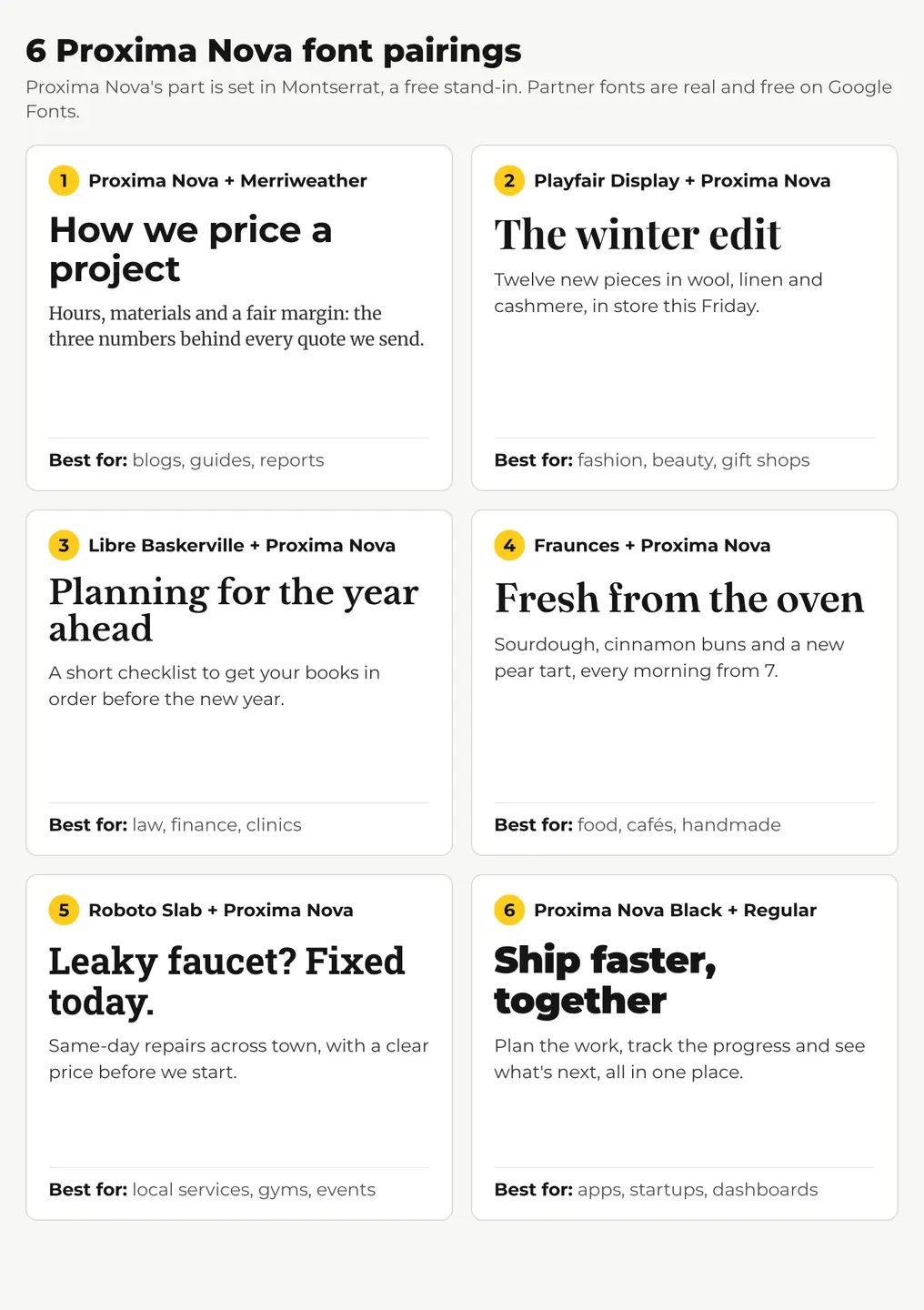
- Proxima Nova Bold + Merriweather. The safe, readable choice for long text. A clean bold headline over a sturdy serif made for screens. Good for blogs, guides and reports.
- Playfair Display + Proxima Nova. High-contrast serif headline, quiet sans body. It looks premium with no extra effort. Start here for fashion, beauty and gift shops.
- Libre Baskerville + Proxima Nova. Traditional and calm. A fit for law and accounting firms, clinics and consultants who want to look established.
- Fraunces + Proxima Nova. Soft, slightly quirky serif headlines with plenty of warmth. Works for cafés, bakeries, food brands and anything handmade.
- Roboto Slab + Proxima Nova. Chunky slab serif headlines that read from across the room. Good for local services, gyms and event posters.
- Proxima Nova Black + Proxima Nova Regular. One family, two weights. It can’t clash, which is why so many apps and startups do exactly this.
Sizes and weights
| Pairing | Headline | Body | Use it for |
|---|---|---|---|
| Proxima Nova + Merriweather | Proxima Nova Bold, 60px | Merriweather Regular, 28px | Blogs, guides, reports |
| Playfair Display + Proxima Nova | Playfair Display Bold, 64px | Proxima Nova Regular, 30px | Fashion, beauty, gift shops |
| Libre Baskerville + Proxima Nova | Libre Baskerville Bold, 56px | Proxima Nova Regular, 30px | Law, finance, clinics |
| Fraunces + Proxima Nova | Fraunces SemiBold, 64px | Proxima Nova Regular, 30px | Food, cafés, handmade |
| Roboto Slab + Proxima Nova | Roboto Slab Bold, 60px | Proxima Nova Regular, 30px | Local services, gyms, events |
| Proxima Nova + Proxima Nova | Proxima Nova Black, 62px | Proxima Nova Regular, 30px | Apps, startups, dashboards |
Want more serif ideas? Our Caslon font pairings and Avenir font pairings use the same layout, so you can compare side by side.
What font goes well with Proxima Nova on a website?
On a website, the most common setup is Proxima Nova for headings and navigation, and either Proxima Nova or a screen serif like Merriweather for body text. Here’s a starting type scale for a blog or shop page:
| Element | Font and weight | Size / line height |
|---|---|---|
| H1 | Proxima Nova Bold | 40px / 1.15 |
| H2 | Proxima Nova Semibold | 28px / 1.25 |
| Body | Merriweather Regular, or Proxima Nova Regular | 18px / 1.6 |
| Buttons and menus | Proxima Nova Semibold | 16px |
| Captions | Proxima Nova Regular | 14px / 1.4 |
Two habits keep it looking right:
- Give the body a little more line height than you think. Proxima Nova has a fairly large x-height (tall lowercase letters), so lines can look crowded at 1.4.
- Don’t use the thinnest weights for body text. Thin and Light look elegant at 60px and disappear at 16px on a phone.
What are free alternatives to Proxima Nova?
If you don’t have Proxima Nova, or you need a font you can embed anywhere for free, these three Google Fonts get close. We set the same words in each:
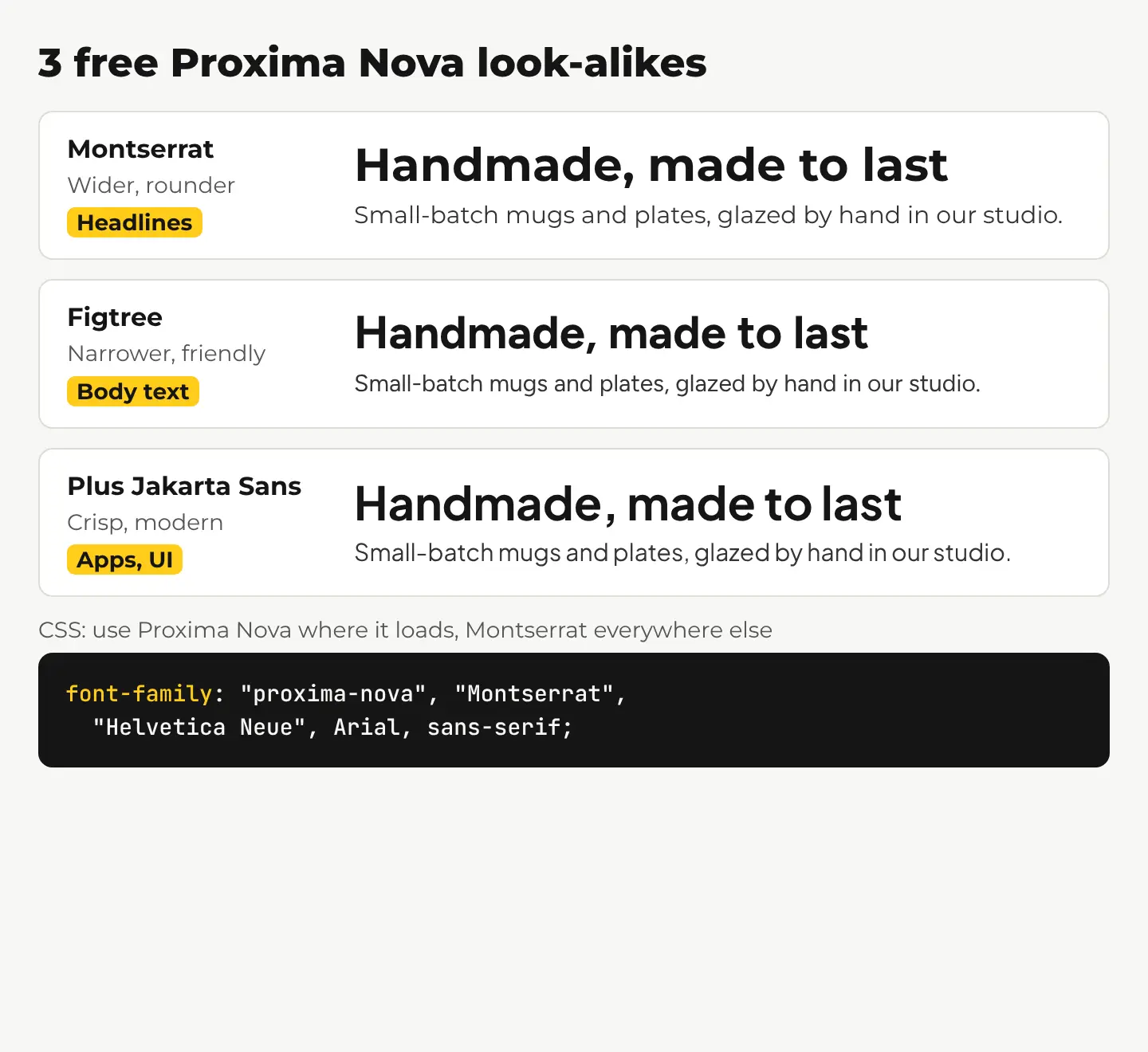
- Montserrat. The most common stand-in, free on Google Fonts with weights from Thin to Black. It’s wider and rounder, so it feels a touch more like a poster. Great for headlines.
- Figtree. Narrower and friendlier, and closer to Proxima Nova in body text. Our pick for paragraphs.
- Plus Jakarta Sans. A bit more modern and crisp. Nice for apps, startups and dashboards.
Fall back gracefully in CSS
If your site loads Proxima Nova through Adobe Fonts, you can still name a free font as the backup. The browser uses the first font in the font-family list that’s available:
font-family: "proxima-nova", "Montserrat", "Helvetica Neue", Arial, sans-serif;
If the Adobe kit fails to load, visitors see Montserrat (load it from Google Fonts) instead of a default system font, and your headings keep their shape.
What does a Proxima Nova pairing look like on a Black Friday post?
Black Friday is a week away, so here’s one 4:5 Instagram post for a small ceramics shop, designed with two pairings. The background is an AI image we made with Create, our AI image generator, for 1 credit. It’s an AI image, not a photo of a real shop. We asked for an empty wall in the top half so the text has room:
A photoreal photo of handmade ceramic mugs and a small stack of plates in soft sage green and cream glazes on a light oak shelf, a folded linen napkin and a sprig of dried eucalyptus beside them, soft warm morning light, all objects in the lower third of the frame, the upper half of the frame is a calm empty warm white wall with nothing on it
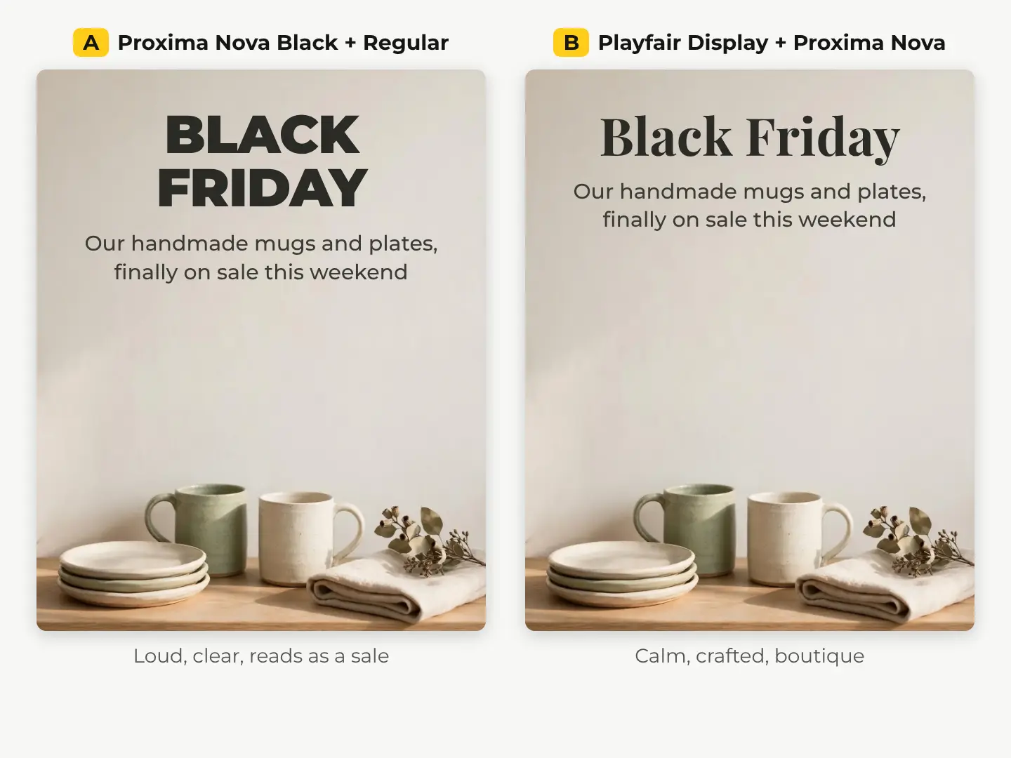
What the comparison shows:
- Version A (Proxima Nova Black + Regular) reads instantly at feed size. It feels like a sale, which is exactly the point on Black Friday.
- Version B (Playfair Display + Proxima Nova) feels like a boutique. It’s the better pick if your brand sells on craft rather than discounts, or for a gift guide.
- Both work because the background has a plain area for the text. On a busy photo you’d need a color box or a gradient behind the words; our guide to making text readable on a photo compares four ways.
Make your Black Friday post in 5 steps
- Pick a pairing. For a sale: Proxima Nova Black + Regular. For a gift guide: Playfair Display + Proxima Nova.
- Get a background with empty space. Pick a real photo from our stock library for 10 credits ($0.10), or describe one in Create for 1 credit and ask for an empty area where the text will go.
- Add the text in our free photo editor. Use the Text tool for the headline and caption, add a color box behind the words if the photo is busy, and pick the text color from the picture so it matches. If Proxima Nova isn’t in the font list, use Montserrat or the closest clean sans and keep the same sizes.
- Check it at phone size. Shrink the preview. If the caption gets lost, make it bigger or bolder, not longer.
- Export every size at once with the social media resizer: the same design for Instagram, Facebook, Pinterest and more, in one zip, free.
New accounts get 50 free credits with no card, then 3 free credits every day, enough to make a few backgrounds and try both pairings before Friday.
Questions people ask
- Is Proxima Nova free to use?
- No. It's a commercial font. It's included in Adobe Fonts with a Creative Cloud plan, or you can buy a license from the foundry. Montserrat and Figtree are free alternatives on Google Fonts.
- Is Proxima Nova on Google Fonts?
- No. The closest free options on Google Fonts are Montserrat for headlines and Figtree for body text.
- Does Proxima Nova go with Helvetica or Arial?
- Not as a headline and body pair. They're all clean sans serifs, so together they look almost the same but not quite. Pair Proxima Nova with a serif, or use two weights of Proxima Nova.
- What is the difference between Proxima Nova and Proxima Nova Soft?
- Proxima Nova Soft is a version with rounded stroke ends. It feels friendlier, so it suits kids' brands, apps and food, and pairs well with soft serifs like Fraunces.
Keep reading
 DesignAvenir font pairing: 6 combinations and free look-alikesAvenir pairs best with a high-contrast serif like Playfair Display or Lora. See 6 pairings with sizes, 3 free look-alikes and a social post done two ways.
 DesignBedroom color palette ideas: 6 palettes, tried on one roomUse one wall color for about 60% of the room, lighter bedding and one accent. Six bedroom palettes with hex codes, light values and an AI room recolored.
 DesignCaslon font pairing: 6 combinations, shown in the real fontsCaslon pairs best with a clean sans like Inter, Work Sans or Lato. See 6 free pairings set in the real fonts, with sizes and a social post done two ways.