Which AI image style fits your brand? One prompt, 4 styles
Keep the scene, swap only the style words. We made one café scene in 4 AI styles for 4 credits: the exact prompts, what each suits, and how to stay consistent.
The right AI image style is the one your audience already expects from you: photoreal when the picture has to feel true, watercolor for warm and handmade, flat vector for clean and modern, 3D clay for friendly and playful. To pick one, keep the scene words the same, swap only the style words, and compare the results side by side.
We did exactly that: one café scene, four styles, four images from our generator for 4 credits in total. Below are the results with the exact prompts, what each style is good for, and how to keep the style you choose consistent from post to post.
What changes when you only change the style words?
Everything about the feel, and almost nothing about the content. That’s the point of the test. If you change the scene and the style at the same time, you can’t tell which words did what.
Every prompt in this article shares the same scene, word for word: “a white ceramic mug of coffee, a croissant on a small plate and a small potted succulent on a round wooden café table beside a sunny window, seen from a slight high angle.” Only the words before and after it change.
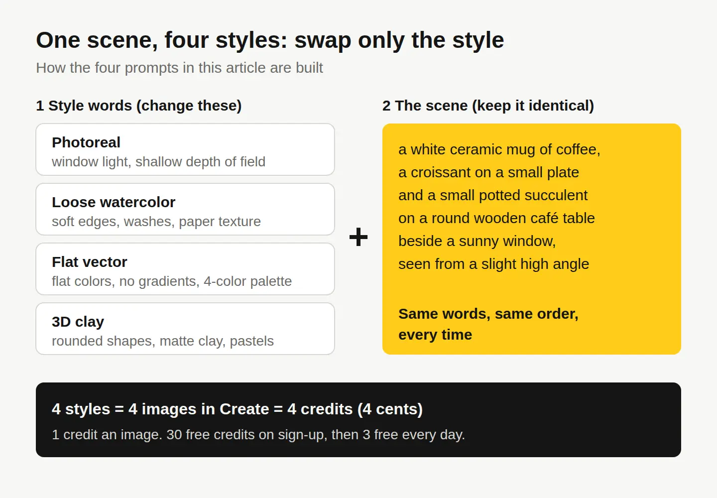
All four images below were made with AI in Create, 1 credit each, on the first try. None of them is a photo.
What does the same scene look like in four styles?
Photoreal
A photoreal photo of a white ceramic mug of coffee, a croissant on a small plate and a small potted succulent on a round wooden café table beside a sunny window, seen from a slight high angle, soft morning window light, shallow depth of field, natural warm colors

The lighting words did the heavy lifting here: warm, low sun, a blurred window and even steam over the cup. It looks like a café photo, which is exactly why it needs care. Don’t use a photoreal AI image where a customer would take it as a real record, like a menu photo of your actual croissant.
Loose watercolor
A loose watercolor painting of a white ceramic mug of coffee, a croissant on a small plate and a small potted succulent on a round wooden café table beside a sunny window, seen from a slight high angle, soft edges, transparent washes, visible paper texture, white paper showing through around the edges
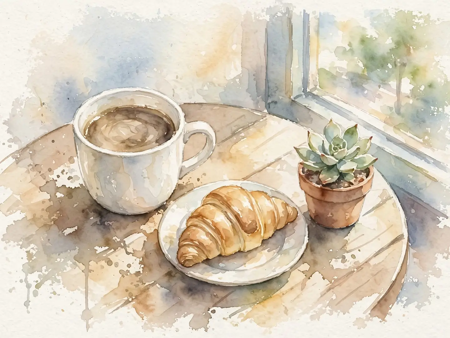
The same three objects, the same table and window, but it now reads as a sketchbook page. The last phrase, about white paper at the edges, is what made it fade out instead of filling the frame. That fade leaves natural room for a headline.
Flat vector
A flat vector illustration of a white ceramic mug of coffee, a croissant on a small plate and a small potted succulent on a round wooden café table beside a sunny window, seen from a slight high angle, simple geometric shapes, flat colors with no gradients or shadows, limited palette of mustard yellow, charcoal, sage green and cream

Naming four colors was the most useful instruction in the whole test: the image uses mustard, charcoal, sage and cream and nothing else. If you have brand colors, this is where they go. The table turned yellow because mustard was named first, so list your main color first.
3D clay
A 3D clay-style render of a white ceramic mug of coffee, a croissant on a small plate and a small potted succulent on a round wooden café table beside a sunny window, seen from a slight high angle, rounded soft shapes, matte handmade clay texture, soft pastel colors, soft even studio lighting

Everything went soft and toy-like, including the table, which is now made of clay planks. “Soft even studio lighting” kept the shadows gentle, so there’s no dramatic sun like in the photoreal version.
Which AI image style should you use for what?
Pick by the job, not by what looks coolest today. Here’s how the four compare, plus the style words that worked for us.
| Style | Style words that worked | Good for | Watch out for |
|---|---|---|---|
| Photoreal | photoreal photo, window light, shallow depth of field, natural colors | Blog headers, mood images, backgrounds, concepts you can’t shoot | Looks real, so never pass it off as your actual product, place or people |
| Loose watercolor | loose watercolor painting, soft edges, transparent washes, visible paper texture | Cafés, bakeries, wellness, invitations, gentle seasonal posts | Fine detail gets lost; text on top needs a solid box behind it |
| Flat vector | flat vector illustration, simple geometric shapes, flat colors, no gradients, named palette | Explainers, app and SaaS graphics, icons, social carousels | Can look generic unless you name your own colors |
| 3D clay | 3D clay-style render, rounded soft shapes, matte clay texture, pastel colors | Kids and family brands, playful promos, announcements | Everything turns cute, which may not suit serious topics |
Two quick rules of thumb:
- If trust matters, use a real photo. For your real team, venue or product, a licensed stock photo or your own shot is the honest choice. Our guide to choosing between a stock photo and an AI image goes deeper on this.
- If you need a look stock doesn’t have, use a style. Illustrated styles are clearly not photos, so nobody mistakes them for a record of reality.
How do you keep one style consistent across posts?
Save the style words as a template and reuse them, word for word, every time. A feed looks like one brand when the style stays fixed and only the subject changes, the reverse of the test above.
- Run the four-style test on your own subject. Use something you’ll actually post about. It costs 4 credits (4 cents).
- Pick one style and write down its exact words. Copy the style part of the prompt, including any colors, into a note you can paste from.
- Name your colors. Two to four colors, main color first. This is what made the flat vector image look designed rather than generic.
- Reuse the same light and angle words. “Soft even studio lighting” and “slight high angle” matter as much as the style name.
- Add a reference image when words aren’t enough. Create lets you add optional reference images to steer the look toward images you already use.
- Change one thing at a time. If an image misses, edit one phrase and try again, instead of rewriting everything. Our guide on writing AI image prompts that get what you want covers fixing near-misses.
If you’d rather test styles without the drafts being saved anywhere, turn on Private mode in Create: the image stays in your browser, and nothing is saved to your account or our servers.
Once you have the image, the free photo editor adds your headline with Text or WordArt, and the social media resizer exports it for every platform in one zip.
Can you use AI images in any style commercially?
Yes. Images you make in Create can be used commercially, in ads, social posts and products. Two things to know: AI images come with no legal protection from us, unlike our licensed stock photos, and they may not be copyrightable in many countries. In the U.S., the Copyright Office’s report on copyrightability says prompts alone aren’t enough for protection, though human arrangement or changes to the output can be (Copyright and Artificial Intelligence, Part 2).
Style words describe a look, like watercolor or clay. Don’t prompt with a living artist’s name, a brand or a famous character; describe the qualities you like instead. The full terms are on our license page.
Your next step
Take the scene you’ll post most this month, like your product, your storefront or a seasonal detail, and write it as one fixed sentence. Paste it into Create four times with the four style lines from the table above, and put the results side by side. It’s 4 credits, and the 30 free credits you get on sign-up, with no card, cover it several times over. Keep the style that looks most like you, and save its words for every post after.
Questions people ask
- Can I use a famous artist's name as a style word?
- It's better not to. Describe the qualities you like instead, such as loose brushstrokes, a muted palette or thick outlines. That gives you a look of your own and avoids copying someone else's work.
- Will I get the exact same image if I reuse a prompt?
- No, each generation is new, so details will vary. Reusing the same style, color, light and angle words keeps the look consistent even when the details change.
- Can I put text into an AI image in these styles?
- Add text afterward instead. Make the image in Create, then add your headline in the free photo editor with Text or WordArt, where you can pick fonts and colors exactly.
- What if none of the four styles fits my brand?
- Try other style words the same way, like pencil sketch, paper cut-out or oil painting, keeping the scene fixed. Each test image costs 1 credit, and you get 3 free credits every day.
Keep reading
 AI image generationHow to write AI image prompts that get what you wantDescribe a photo, not a topic: style, subject, setting, light, color and camera. See one idea prompted two ways, with the real results and exact prompts.
 Creator businessHow to plan a Q4 social media content calendarMark the fixed dates, split 13 weeks into three phases, and budget every image up front. A 39-post plan whose images cost 108 credits in total.
 Photo editingHow to change the season in a photo with AIName the season, say what changes and what stays, and one AI edit turns summer into fall. A real before and after, the exact prompts and a season cheat sheet.